In the early 2000s, CSS was becoming an unmanageable mess. Stylesheets grew to thousands of lines, selectors spiraled into specificity wars, and every new feature request sent developers scrambling to patch yet another fragile rule. Then Nicole Sullivan stepped onto conference stages with a radical proposition: treat your CSS like real software engineering. Her Object-Oriented CSS methodology didn’t just offer a better way to write stylesheets — it fundamentally changed how the industry thinks about scalable, maintainable front-end architecture.
Early Life and Education
Nicole Sullivan grew up with an intellectual curiosity that eventually drew her toward the intersection of technology and design. She studied at a time when the web was still finding its identity — HTML tables were the dominant layout mechanism, and CSS was considered a secondary concern by most developers. Sullivan pursued her education with a focus that bridged computer science and visual communication, recognizing early that the web’s presentation layer deserved the same rigor applied to back-end systems.
Her academic background gave her a unique perspective. While many front-end developers of that era came from either pure design or pure programming backgrounds, Sullivan understood both worlds. This dual fluency would prove essential when she later articulated why CSS needed structural thinking — not just visual intuition. She absorbed principles from software engineering, including separation of concerns, modularity, and the DRY (Don’t Repeat Yourself) principle, and began wondering why none of these ideas had made their way into stylesheet authoring.
After completing her studies, Sullivan entered the web industry during a period of rapid growth. The CSS Zen Garden had demonstrated CSS’s visual power, but real-world codebases were far messier than curated demos. Sullivan’s early career exposed her to the painful reality of enterprise CSS — bloated files, redundant declarations, and teams afraid to touch existing styles for fear of breaking something elsewhere. These experiences planted the seeds for what would become OOCSS.
The OOCSS Breakthrough
Technical Innovation
Object-Oriented CSS, introduced by Sullivan around 2008-2009, was built on two core principles: separate structure from skin, and separate container from content. The first principle meant that the layout patterns (width, height, margin, padding, positioning) should be defined independently from the visual decorations (colors, gradients, borders, shadows). The second principle dictated that an element’s styling should not depend on where it sits in the DOM tree.
Consider the traditional approach versus the OOCSS approach. In legacy CSS, developers would write deeply nested selectors tied to specific page locations:
/* Traditional approach — tightly coupled */
#sidebar .widget .widget-title {
  font-size: 1.2rem;
  font-weight: 600;
  color: #333;
  border-bottom: 2px solid #c2724e;
  padding-bottom: 0.5rem;
  margin-bottom: 1rem;
}

#main-content .article .article-title {
  font-size: 1.2rem;
  font-weight: 600;
  color: #333;
  border-bottom: 2px solid #c2724e;
  padding-bottom: 0.5rem;
  margin-bottom: 1rem;
}

/* OOCSS approach — reusable objects */
.heading-decorated {
  font-size: 1.2rem;
  font-weight: 600;
  color: #333;
  border-bottom: 2px solid #c2724e;
  padding-bottom: 0.5rem;
  margin-bottom: 1rem;
}
This seems obvious in retrospect, but in 2008 it was revolutionary. Sullivan demonstrated that by identifying repeating visual patterns across a site and abstracting them into reusable CSS “objects,” teams could reduce stylesheet size by 50% or more. Her work on the Facebook front-end proved this at massive scale — she helped reduce the company’s CSS footprint significantly while making it easier for hundreds of engineers to contribute styles without conflicts.
Sullivan also created the Media Object — perhaps the most famous CSS component pattern ever documented. It describes any content block with an image on one side and text on the other, a pattern that appears dozens of times on virtually every web page. By naming it, defining it, and making it reusable, she gave teams a shared vocabulary for discussing UI patterns.
/* The Media Object — Sullivan's most influential pattern */
.media {
  display: flex;
  align-items: flex-start;
  gap: 1rem;
}

.media-img {
  flex-shrink: 0;
}

.media-body {
  flex: 1;
  min-width: 0;
}

/* Skin variations — separated from structure */
.media--bordered {
  border: 1px solid #e7e5e4;
  border-radius: 0.5rem;
  padding: 1rem;
}

.media--centered {
  align-items: center;
}
Why It Mattered
Before OOCSS, the web industry treated CSS as an afterthought — something designers “just figured out.” There was no shared methodology, no architectural thinking, and no systematic approach to managing stylesheets at scale. Sullivan’s work proved that CSS deserved the same engineering discipline as any other programming language.
The impact was both immediate and long-lasting. OOCSS directly influenced every major CSS methodology that followed. Eric Meyer, who had spent years documenting CSS specifications, recognized Sullivan’s contribution as a paradigm shift in how practitioners thought about stylesheets. Jonathan Snook’s SMACSS (Scalable and Modular Architecture for CSS) built directly on OOCSS principles. The BEM (Block, Element, Modifier) methodology from Yandex formalized similar ideas with a stricter naming convention. Even modern utility-first frameworks like Tailwind CSS owe a philosophical debt to Sullivan’s insight that visual patterns should be abstracted into reusable, composable units.
Sullivan’s approach also changed how companies hired and organized front-end teams. Before OOCSS, CSS was often handled by whoever happened to be nearest — a designer, a junior developer, or sometimes a back-end engineer begrudgingly adding inline styles. After Sullivan demonstrated that CSS architecture was a real engineering discipline, organizations began investing in dedicated front-end architects and establishing CSS coding standards, much like the coding standards that Brendan Eich‘s JavaScript community had developed.
Other Major Contributions
Sullivan’s influence extends well beyond OOCSS. She was a key figure in the web performance movement, championing the idea that front-end optimization was not a luxury but a core responsibility. Her talks on CSS performance — covering topics like selector efficiency, rendering pipelines, and paint optimization — helped developers understand that their stylesheet choices had real consequences for page speed and user experience. This performance-first mindset aligned with the broader movement led by figures like Steve Souders, who pioneered web performance measurement tools.
At Google, Sullivan joined the Chrome team, where she worked on browser developer tools and performance diagnostics. Her experience optimizing real-world CSS at Facebook gave her unique insight into what developers actually needed from browser tooling. She contributed to making Chrome DevTools more useful for diagnosing CSS performance issues, helping bridge the gap between browser internals and everyday developer workflows. This work complemented the browser tooling efforts that Paul Irish was leading on Chrome DevTools.
Sullivan also co-created CSS Lint, one of the first static analysis tools for CSS. Just as JavaScript had JSLint (and later ESLint), CSS Lint gave teams automated feedback on common CSS anti-patterns: overly qualified selectors, duplicate properties, empty rules, and inefficient patterns. The tool encoded Sullivan’s architectural principles into automated checks, making it possible for teams to maintain code quality at scale without relying solely on manual code review.
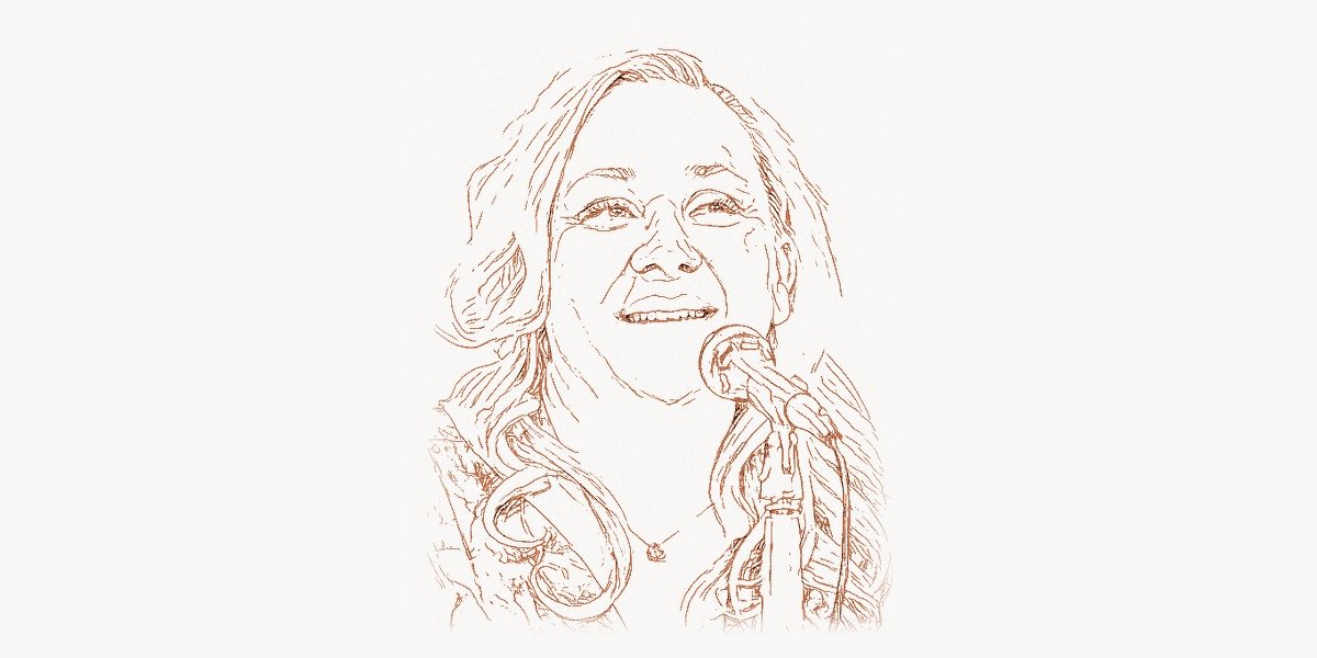
Her conference speaking career brought these ideas to a global audience. Sullivan was a featured speaker at events including Velocity, An Event Apart, and CSSconf, where her talks combined technical depth with practical, real-world case studies. She had a talent for making complex architectural concepts accessible — explaining why a CSS refactoring strategy could save a company millions in reduced page load times and developer productivity.
Beyond technical contributions, Sullivan played an important role in advocating for diversity and inclusion in the tech industry. She used her platform to highlight underrepresented voices and mentor emerging developers, particularly those entering front-end development from non-traditional backgrounds. Her work demonstrated that CSS expertise was valuable, intellectually demanding, and worthy of respect — pushing back against the persistent dismissal of front-end work as “not real programming.” This advocacy helped create space for specialists like Lea Verou and Jen Simmons to receive recognition for their CSS innovations.
Philosophy and Approach
Sullivan’s technical work was always grounded in a coherent engineering philosophy. She believed that the web’s greatest strength — its accessibility and universality — was undermined by sloppy front-end practices. Every unnecessary kilobyte of CSS, every redundant rule, every specificity hack was a small tax on users, especially those on slower connections or less powerful devices. Her philosophy can be summarized through several core tenets that continue to shape modern front-end development.
Key Principles
- Favor composition over inheritance. Rather than building complex selector hierarchies, create small, focused CSS classes that can be combined to achieve the desired visual result. This mirrors the composition-over-inheritance principle from object-oriented programming.
- Separate structure from skin. The box model properties (dimensions, positioning, margins) should be defined independently from decorative properties (colors, backgrounds, borders). This allows visual themes to change without affecting layout.
- Separate container from content. An element’s appearance should not depend on its location in the DOM. A heading styled as
.heading-primaryshould look the same whether it appears in the sidebar, the main content area, or a modal dialog. - Extend through variation, not duplication. When a new visual variant is needed, create a modifier class rather than copying and tweaking an existing block of CSS. This keeps the stylesheet DRY and makes updates predictable.
- Measure before optimizing. Sullivan consistently advocated for data-driven CSS optimization. Rather than guessing which selectors were slow or which rules were redundant, she pushed for tools and metrics that revealed actual performance bottlenecks.
- Name things for what they are, not where they go. Class names like
.media,.flag, and.islanddescribe a pattern’s structural purpose, not its position on a specific page. This makes components genuinely reusable across contexts. - Performance is a feature. CSS optimization is not a nice-to-have polish step at the end of a project. It is a core design constraint that should inform architectural decisions from the start. Every team building web applications can benefit from project management tools like Taskee to track performance budgets alongside feature work.
Legacy and Impact
Nicole Sullivan’s legacy is woven into the fabric of modern web development in ways that many practitioners may not even realize. Every time a developer creates a reusable component class, separates layout utilities from decorative styles, or thinks in terms of composable CSS patterns, they are building on foundations Sullivan laid.
The component-driven architecture that dominates modern front-end frameworks — React, Vue, Svelte — owes a significant conceptual debt to OOCSS. When Jordan Walke and the React team introduced component-based UI development, the underlying idea of encapsulated, reusable UI objects mapped directly onto the patterns Sullivan had been advocating in CSS for years. CSS-in-JS solutions, CSS Modules, and scoped styles are all, in a sense, technical implementations of the modularity Sullivan championed through convention and discipline.
The design systems movement — Salesforce’s Lightning, Google’s Material Design, GitHub’s Primer — reflects Sullivan’s vision of a shared, systematic approach to UI components. These systems codify exactly what Sullivan was doing manually: identifying repeating visual patterns, abstracting them into named objects, and providing a consistent vocabulary for teams to use. Modern web agencies like Toimi now routinely implement component-based design systems as a standard practice, a direct legacy of the architectural thinking Sullivan pioneered.
In the performance domain, Sullivan’s insistence that CSS was a critical rendering path bottleneck influenced browser vendors to invest in CSS parsing and rendering optimizations. The Chrome team’s work on Blink, the rendering engine, reflects a sensitivity to real-world CSS patterns that Sullivan and her peers brought to the table. Tools like Lighthouse, which now audit CSS as part of their performance scoring, trace their conceptual lineage to Sullivan’s advocacy for measurable, accountable front-end performance.
Perhaps most importantly, Sullivan helped elevate CSS from a “soft skill” to a recognized engineering discipline. Before her work, CSS expertise was often undervalued — seen as a necessary but unglamorous part of web development. Sullivan proved that CSS architecture was intellectually rigorous, commercially valuable, and worthy of the same respect given to back-end systems design. This shift in perception opened doors for an entire generation of front-end specialists and contributed to the professionalization of web development as a whole, much like Jeffrey Zeldman‘s earlier advocacy for web standards had legitimized standards-based development practices.
Key Facts
- Created the Object-Oriented CSS (OOCSS) methodology around 2008-2009, transforming how the industry approaches stylesheet architecture
- Coined and documented the Media Object pattern, one of the most widely replicated CSS component patterns in web history
- Worked at Facebook where she led CSS optimization efforts, dramatically reducing stylesheet size for one of the world’s largest websites
- Joined Google’s Chrome team, contributing to developer tools and browser performance diagnostics
- Co-created CSS Lint, one of the first automated static analysis tools for CSS code quality
- Directly influenced subsequent CSS methodologies including SMACSS, BEM, and ITCSS
- Pioneered the concept of CSS performance budgets and data-driven stylesheet optimization
- Prominent conference speaker at major web events including Velocity, An Event Apart, and CSSconf
- Advocated for diversity in tech, mentoring developers from underrepresented backgrounds
- Her OOCSS principles laid the conceptual groundwork for modern component-based CSS architectures and design systems
FAQ
What is Object-Oriented CSS and how does it differ from traditional CSS?
Object-Oriented CSS is a methodology for writing scalable, maintainable stylesheets by treating visual patterns as reusable “objects.” Unlike traditional CSS, which often relies on deeply nested selectors tied to specific HTML structures, OOCSS encourages developers to identify repeating visual patterns across a site and abstract them into independent, composable classes. The two foundational principles are separating structure from skin (layout properties from decorative properties) and separating container from content (ensuring styles work regardless of where an element appears in the DOM). This approach reduces code duplication, lowers specificity conflicts, and makes stylesheets easier to maintain as projects grow.
How did Nicole Sullivan’s work at Facebook influence modern CSS practices?
At Facebook, Sullivan applied OOCSS principles to one of the world’s largest and most complex web applications. She demonstrated that systematic CSS architecture could dramatically reduce stylesheet file size while making it easier for large engineering teams to contribute styles without creating conflicts or regressions. Her work proved that CSS optimization was not just a theoretical exercise but a practical discipline with measurable business impact — faster page loads, reduced bandwidth costs, and improved developer productivity. The success of OOCSS at Facebook’s scale gave the methodology credibility and encouraged adoption across the industry.
What is the Media Object and why is it considered so important?
The Media Object is a CSS component pattern Sullivan identified and documented: any content block featuring a fixed-width image or icon on one side and flexible text content on the other. While the pattern had existed implicitly on virtually every website, Sullivan was the first to name it, define its structural requirements, and demonstrate how a single reusable CSS class could replace dozens of redundant style definitions. The Media Object became a foundational building block in CSS frameworks and design systems, and it demonstrated a key OOCSS insight — that naming and abstracting common visual patterns is the first step toward scalable stylesheet architecture.
How does OOCSS relate to modern CSS methodologies like BEM and utility-first frameworks?
OOCSS was the intellectual predecessor to virtually all modern CSS methodologies. BEM (Block, Element, Modifier) formalized OOCSS’s component-thinking with a strict naming convention. SMACSS organized stylesheets into categories that aligned with OOCSS’s separation principles. ITCSS introduced an inverted triangle model for specificity management that builds on OOCSS’s approach to reducing selector conflicts. Even utility-first frameworks like Tailwind CSS extend Sullivan’s core insight — that abstract, reusable style definitions are more maintainable than bespoke, location-dependent rules. While each methodology adds its own conventions and opinions, they all share the foundational OOCSS premise that CSS should be treated as a structured engineering discipline rather than an ad hoc collection of visual overrides.