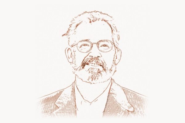
In the world of software, engineers build the engine, but designers build the experience. Few people have shaped the way billions interact with technology as profoundly as Matias Duarte. As VP of Design at Google, he led the creation of Material Design — a unified design language that standardized visual interaction across Android, Chrome OS, web applications, and the entire Google ecosystem. Before Google, he was the visionary behind webOS at Palm, a mobile operating system so elegant that its design DNA still echoes through every swipe and gesture we perform on modern smartphones. Duarte belongs to a rare category of technologists who prove that how something feels is just as important as what it does.
Early Life and the Roots of a Design Thinker
Matias Duarte was born in 1973 and raised in a bilingual household that blended Chilean and American cultures. Growing up between two worlds gave him an early sensitivity to context — the idea that the same message lands differently depending on how it is framed. His family valued both the arts and the sciences, and young Matias gravitated toward the intersection of the two long before “design thinking” became a Silicon Valley buzzword.
Duarte studied at the University of Maryland, where he explored graphic design, computer science, and human-computer interaction. He was drawn to the then-nascent field of interaction design — the discipline concerned not with how something looks in a static mockup, but with how it behaves when a person touches it, drags it, or swipes across it. This distinction between static aesthetics and dynamic behavior would become the central thread of his entire career.
During his university years, Duarte was influenced by the work of pioneers like Jakob Nielsen, whose usability heuristics established measurable standards for judging whether an interface actually served its users. But where Nielsen focused on removing friction through analytical evaluation, Duarte became interested in something more elusive: delight. He wanted interfaces that did not merely avoid confusion but actively pleased the people who used them.
Early Career: From Helio to Danger
After graduating, Duarte entered the mobile industry at a time when phones were still largely utilitarian devices with tiny screens and physical keypads. He joined Helio, a mobile virtual network operator that attempted to differentiate itself through design-forward handsets and services aimed at young, tech-savvy users. At Helio, Duarte got his first taste of designing for mobile constraints — small screens, limited processing power, and users who expected instant responsiveness.
He then moved to Danger, Inc., the company behind the T-Mobile Sidekick. The Sidekick was a cult device — beloved by teenagers and celebrities for its flip-out QWERTY keyboard and its surprisingly capable mobile internet experience. At Danger, Duarte worked on the user interface that made the Sidekick feel fun and approachable at a time when most phones treated their software as an afterthought. The experience taught him a critical lesson: hardware and software had to be designed together as a single, cohesive experience. A beautiful interface running on clunky hardware felt dishonest, and powerful hardware with a confusing interface felt wasteful.
This philosophy of hardware-software unity would later inform his most celebrated work. It also connected him to a broader tradition in the industry — the same principle that Andy Rubin would carry from Danger into the creation of Android, and that Apple had practiced since the original Macintosh.
Palm and the webOS Revolution
In 2007, Apple released the iPhone and permanently altered the expectations of every mobile user on the planet. The established players — Nokia, BlackBerry, Palm — suddenly found themselves scrambling to respond. Palm, once the dominant name in handheld computing, was in serious trouble. They hired Matias Duarte to lead the design of their response: webOS.
Launched in 2009 on the Palm Pre, webOS was a revelation. While Android at the time was still rough around the edges and iOS was still locked into its original grid-of-icons paradigm, webOS introduced concepts that were years ahead of their competition. The card-based multitasking system let users see all their running applications as physical cards that could be flicked through and tossed away with a swipe. Synergy unified contacts, calendars, and messages from multiple accounts into single, merged views. Notifications arrived as unobtrusive banners at the bottom of the screen rather than as modal interruptions that seized control of the entire display.
These were not minor interface tweaks. They were fundamental rethinkings of how a person should relate to a pocket computer. The card metaphor treated apps not as destinations but as living tasks that could be picked up, rearranged, and discarded. The gesture-based navigation eliminated the need for a dedicated back button — a design choice so sound that Apple adopted swipe-based navigation years later, and Android eventually moved to gesture navigation in Android 10.
Consider how webOS handled its application lifecycle. The card model was conceptually similar to how modern front-end frameworks manage component state and lifecycle hooks. A simplified representation of the pattern might look like this:
// Conceptual model: webOS card lifecycle
// Each "card" is an app instance with its own state

class AppCard {
  constructor(appId) {
    this.appId = appId;
    this.state = 'launching';
    this.snapshot = null;
  }

  activate() {
    this.state = 'active';
    // Full rendering, all event listeners attached
    this.restoreFromSnapshot();
    document.dispatchEvent(
      new CustomEvent('card:activated', { detail: this.appId })
    );
  }

  deactivate() {
    this.state = 'backgrounded';
    // Capture visual snapshot for card view
    this.snapshot = this.captureVisualState();
    // Reduce resource usage, pause animations
    this.suspendNonCriticalProcesses();
  }

  dismiss() {
    this.state = 'closing';
    // Animate card flying off screen
    this.animateExit().then(() => {
      this.cleanup();
      this.state = 'terminated';
    });
  }

  captureVisualState() {
    return {
      thumbnail: this.renderToCanvas(),
      scrollPosition: this.getScrollOffset(),
      timestamp: Date.now()
    };
  }
}
Despite its brilliance, webOS was a commercial failure. Palm lacked the marketing muscle, app ecosystem, and carrier relationships to compete with Apple and the rapidly growing Android alliance. HP acquired Palm in 2010, fumbled the webOS tablet launch, and ultimately abandoned the hardware. But the ideas survived — and the designer behind them was about to get a much larger canvas.
Joining Google: The Android Challenge
In 2012, Google hired Matias Duarte as VP of Design. The timing was significant. Android had won the market share war through sheer volume — dozens of manufacturers, hundreds of handsets, an open ecosystem that made it the default choice for anyone who was not buying an iPhone. But Android had an identity crisis. Every manufacturer skinned Android differently. Samsung’s TouchWiz looked nothing like HTC’s Sense, which looked nothing like stock Android. There was no visual coherence, no consistent design language, no sense that all these devices belonged to the same family.
Duarte’s first major impact was Android 4.0 Ice Cream Sandwich and the Holo design language. Holo introduced a dark, clean aesthetic with consistent navigation patterns — the action bar at the top, the navigation bar at the bottom, and clear typographic hierarchy throughout. It was the first time Android felt like it had a genuine point of view about design rather than simply copying iOS or letting each manufacturer improvise.
But Holo was only the beginning. Duarte understood that Google’s design problem was not limited to Android. Google had dozens of products — Gmail, Maps, Drive, YouTube, Chrome, Docs — each designed by separate teams with separate visual languages. A user moving from Gmail to Google Calendar to Google Drive experienced three different design philosophies. The inconsistency was not just an aesthetic issue; it was a usability tax that forced users to relearn interaction patterns every time they switched products.
Material Design: A Unified Theory of Digital Surfaces
In 2014, at Google I/O, Duarte unveiled Material Design. It was not merely a style guide or a set of color recommendations. It was an attempt to create a comprehensive theory of digital interfaces grounded in the metaphor of physical materials — specifically, paper and ink.
The core insight was that digital interfaces should behave as if they were made of intelligent sheets of paper existing in a three-dimensional space. These sheets could move, expand, split, and rejoin. They cast shadows that communicated their elevation — how far above the baseline surface they floated. A floating action button hovering above a list cast a deeper shadow than the toolbar at the top of the screen, communicating visual hierarchy through a language that every human intuitively understood from living in a world with real light sources.
Material Design codified this into a rigorous system. Every element had a defined elevation measured in density-independent pixels. Transitions between states followed specific motion curves — not linear, but eased in ways that mimicked the physics of real objects. A card expanding to fill the screen did not simply scale up; it accelerated, decelerated, and settled, like a physical object subject to momentum and friction. This attention to motion was heavily influenced by Disney’s twelve principles of animation, adapted for the micro-interactions of touch interfaces. The work of designers like Jen Simmons in championing intrinsic, responsive layouts shared a similar philosophical foundation — the belief that design systems must adapt fluidly to their context.
The elevation system that underpins Material Design can be understood through how shadow values are calculated and applied. Modern CSS implementations of this concept look something like this:
/* Material Design elevation system in CSS */
/* Each level defines ambient + key light shadows */

:root {
  /* Elevation 0 — resting on surface */
  --md-elevation-0: none;

  /* Elevation 1 — card, search bar */
  --md-elevation-1:
    0 1px 3px 0 rgba(0, 0, 0, 0.12),   /* key shadow */
    0 1px 2px 0 rgba(0, 0, 0, 0.24);    /* ambient shadow */

  /* Elevation 2 — raised button, nav drawer */
  --md-elevation-2:
    0 3px 6px 0 rgba(0, 0, 0, 0.15),
    0 2px 4px 0 rgba(0, 0, 0, 0.12);

  /* Elevation 4 — app bar */
  --md-elevation-4:
    0 6px 10px 0 rgba(0, 0, 0, 0.14),
    0 1px 18px 0 rgba(0, 0, 0, 0.12);

  /* Elevation 8 — modal bottom sheet, FAB */
  --md-elevation-8:
    0 8px 17px 2px rgba(0, 0, 0, 0.14),
    0 3px 14px 2px rgba(0, 0, 0, 0.12);

  /* Elevation 16 — navigation drawer (overlay) */
  --md-elevation-16:
    0 16px 24px 2px rgba(0, 0, 0, 0.14),
    0 6px 30px 5px rgba(0, 0, 0, 0.12);
}

/* Transition between elevation states */
.md-card {
  box-shadow: var(--md-elevation-1);
  transition: box-shadow 280ms cubic-bezier(0.4, 0, 0.2, 1);
  border-radius: 4px;
}

.md-card:hover {
  box-shadow: var(--md-elevation-4);
}

/* The cubic-bezier(0.4, 0, 0.2, 1) is the standard
   Material easing curve — fast out, slow in —
   mimicking natural deceleration */
Material Design succeeded where many design systems had failed because it operated at multiple levels simultaneously. It gave designers a philosophical framework (physical metaphor and meaningful motion), a practical toolkit (specific color palettes, type scales, spacing grids, and component specifications), and an implementation library (Material Design Components for Android, iOS, web, and Flutter). This multi-layered approach meant that a solo developer building a weekend project and a fifty-person team at a Fortune 500 company could both adopt the system at whatever level of depth suited their needs.
Material You and the Evolution of Personalization
By 2021, Material Design had matured significantly, but Duarte and his team recognized that the original system, while consistent, could feel rigid. Every Material app looked similar — which was the point, but it also meant that users could not make their devices feel personally theirs. Android 12 and the launch of Material You (also called Material Design 3) addressed this with dynamic color theming.
Material You extracted a color palette from the user’s wallpaper and applied it across the entire system — notifications, settings, quick toggles, and any app that adopted the new theming APIs. The technical implementation used a color science algorithm that identified a source color from the wallpaper image and then generated a complete tonal palette with mathematically harmonious variations for primary, secondary, tertiary, error, and neutral roles. The result was that no two devices looked exactly alike, yet all of them remained cohesive and accessible because the color relationships were governed by rules rather than arbitrary choices.
This was a philosophical shift. Material Design 1 said: “Here is how things should look.” Material You said: “Here are the rules by which things should adapt to you.” The system moved from prescription to parameterization, from a fixed answer to a generative grammar. It was a design approach that resonated deeply with how modern design agencies approach client work — teams like those at Toimi understand that great design is not about imposing a single aesthetic but about building systems that flex intelligently to context while maintaining coherence.
Design Philosophy: Motion as Communication
One of Duarte’s most distinctive contributions to the design field is his insistence that motion is not decoration — it is communication. In his talks and interviews, he frequently returns to the idea that static mockups are incomplete specifications. A button that pulses gently when it becomes active communicates availability. A list item that slides in from the right communicates that it arrived from somewhere and can return there. A deleted email that shrinks and fades communicates finality.
This philosophy stands in contrast to the “flat design” movement that dominated the mid-2010s, which stripped interfaces of shadows, gradients, and depth in pursuit of minimalism. Duarte argued that removing visual cues in the name of simplicity was a false economy — it made interfaces look cleaner in screenshots but made them harder to use in practice because users lost the spatial and temporal signals that helped them build mental models of the system.
His approach drew from animation theory, cognitive psychology, and theatrical staging. He spoke about interfaces having “choreography” — the coordinated timing of multiple elements moving in response to a user action. When a user taps a list item and it expands to a detail view, the title might move upward and grow while the image scales and repositions — not simultaneously, but in a carefully staggered sequence that guides the eye and creates a narrative connection between the two states. This is the same attention to transitional coherence that Jordan Walke pursued on the engineering side when building React’s virtual DOM reconciliation — the principle that users should perceive continuity even when the underlying representation changes dramatically.
The webOS Legacy: Ideas That Outlived Their Product
Perhaps the most fascinating aspect of Duarte’s career is the afterlife of webOS. The product failed commercially, but its ideas colonized the entire mobile industry. Card-based multitasking appeared in iOS 7 (2013) and became Android’s default task switcher. Non-intrusive banner notifications arrived in iOS 5 (2011) — two years after webOS introduced them. Gesture-based navigation, pioneered by webOS’s swipe-from-bezel interaction, became the standard on both iOS (with the iPhone X in 2017) and Android (with Android 10 in 2019).
The lesson is one that recurs throughout the history of technology: the first product to introduce an idea is rarely the one that profits from it. What matters is whether the idea is sound enough to survive the death of its original vessel. WebOS was a proof of concept for a more humane approach to mobile computing, and Duarte was the person who carried those proven concepts into Android, where they reached billions.
This pattern echoes the trajectory of many innovations in the web framework ecosystem — ideas like reactive data binding, component composition, and declarative UI surfaced in smaller projects long before they were adopted by mainstream frameworks. The innovator’s advantage is not always commercial; sometimes it is philosophical.
Impact on the Broader Design Industry
Material Design’s influence extends far beyond Google’s own products. By publishing the specification openly and providing free component libraries, Google effectively set a floor for design quality across the entire Android ecosystem and, increasingly, the web. Startups that could not afford dedicated design teams could adopt Material components and immediately achieve a level of visual coherence and usability that would have previously required significant design investment.
The component-based architecture of Material Design also influenced how design tools evolved. Tools like Figma, Sketch, and Adobe XD developed component and design token systems that mirror the way Material organizes its elements — a connection that reflects the broader convergence of design and engineering practices. The CSS methodologies championed by figures like Nicole Sullivan and her Object-Oriented CSS approach were driven by the same impulse: creating reusable, composable units of design that could scale across large systems without descending into chaos.
For teams building digital products today, the Material Design system offers a practical starting point that can be customized to fit brand requirements. Organizations like Taskee demonstrate how project management platforms benefit from design systems that provide consistent interaction patterns — when users do not have to relearn how buttons, forms, and navigation work, they can focus entirely on their actual tasks.
Duarte’s Role in Google’s Design Culture
Beyond the artifacts he produced, Duarte’s impact on Google’s organizational culture should not be underestimated. Before his arrival, Google was famously an engineering-first company. The legend of Google testing 41 shades of blue for a link color — optimizing through A/B testing rather than design judgment — captured the prevailing attitude. Design was seen as something to be validated through data, not something that could lead through vision.
Duarte helped shift this culture. He advocated for designers having a seat at the table alongside engineers and product managers, not as decorators who applied polish at the end of a development cycle but as co-creators who shaped the product from its earliest conception. This cultural change was arguably as significant as any specific design artifact, because it established the conditions under which future design innovation at Google could happen.
The elevation of design within Google also had ripple effects across the industry. When the largest technology company in the world signals that design leadership matters, other companies follow. The explosion of VP of Design and Chief Design Officer roles across Silicon Valley in the mid-2010s owed something to Google’s visible commitment to design as a strategic discipline — a commitment personified by Duarte.
Criticism and Challenges
Duarte’s work has not been without criticism. Material Design, despite its elegance, has been accused of creating visual monotony — the “everything looks like a Google app” problem. When a design system is adopted widely enough, its consistency becomes homogeneity. Some designers argued that Material’s opinionated specifications left insufficient room for brand differentiation, particularly for consumer-facing applications where visual distinctiveness is a competitive advantage.
The complexity of the full Material specification has also been a point of contention. The complete system encompasses hundreds of pages of guidelines covering color, typography, motion, layout, iconography, and component behavior. For small teams, absorbing the full specification can feel overwhelming, leading to partial adoption that captures the surface appearance but misses the deeper principles — particularly around motion and elevation — that give Material its coherence.
There was also the persistent gap between Material Design as specified and Material Design as implemented. Google’s own apps did not always follow the guidelines consistently, which undermined the system’s credibility. If the company that created Material could not maintain perfect adherence, what hope did third-party developers have? This tension between specification and implementation is familiar to anyone who has worked with the CSS frameworks — the gap between what a system prescribes and what teams actually ship is where most design debt accumulates.
Legacy and Continuing Influence
As of the mid-2020s, Matias Duarte’s influence on the technology landscape is both specific and diffuse. Specifically, Material Design remains one of the most widely adopted design systems in history, implemented across Android, Flutter, the web, and countless third-party applications. The component libraries, design tokens, and theming systems he helped establish have become industry standards that other design systems — including Apple’s Human Interface Guidelines and Microsoft’s Fluent Design — have responded to and competed with.
Diffusely, Duarte changed the conversation about what design means in the context of software. He demonstrated that a design system could be simultaneously philosophical (grounded in a metaphor and a set of principles), practical (providing specific, implementable guidelines), and scalable (working for a single-developer project and a billion-user platform alike). He proved that a designer could wield as much strategic influence as an engineer or a product manager, and that the best technology companies needed all three disciplines working as equals.
His career arc — from the cult-beloved Sidekick, through the brilliant-but-doomed webOS, to the planetary scale of Google — illustrates a truth about design careers that mirrors the tech industry itself. Ideas need time to find their audience. Talent needs the right platform to reach its full expression. And sometimes the most important contribution a person makes is not a product that ships but a way of thinking that permeates an entire industry.
Frequently Asked Questions
What is Material Design and why was it created?
Material Design is a comprehensive design system developed by Google under Matias Duarte’s leadership, first unveiled at Google I/O in 2014. It was created to solve the problem of visual and interaction inconsistency across Google’s many products and across the fragmented Android device ecosystem. The system uses a physical metaphor — intelligent sheets of paper existing in three-dimensional space — to provide intuitive visual hierarchy through elevation, shadow, and motion. It includes detailed specifications for color, typography, layout, components, and animation, along with implementation libraries for Android, iOS, web, and Flutter.
What was webOS and why did it fail?
webOS was a mobile operating system designed by Matias Duarte at Palm, launched in 2009 on the Palm Pre. It introduced several revolutionary concepts including card-based multitasking, non-intrusive banner notifications, and gesture-based navigation — all of which were later adopted by iOS and Android. Despite its design excellence, webOS failed commercially because Palm lacked the app ecosystem, marketing resources, and carrier partnerships to compete with Apple and Google. HP acquired Palm in 2010 but abandoned the platform after a failed tablet launch.
How did Matias Duarte change Android’s design?
Duarte joined Google in 2012 and led the creation of the Holo design language for Android 4.0 Ice Cream Sandwich, which gave Android its first coherent visual identity. He then spearheaded Material Design for Android 5.0 Lollipop, which provided a comprehensive design framework including consistent navigation patterns, elevation-based visual hierarchy, meaningful motion, and a standardized component library. Later, he led the evolution to Material You in Android 12, which introduced dynamic color theming based on the user’s wallpaper.
What is Material You and how does it differ from the original Material Design?
Material You, also known as Material Design 3, was introduced with Android 12 in 2021. While the original Material Design provided a fixed visual specification that all apps were expected to follow, Material You introduced personalization through dynamic color theming. The system extracts a source color from the user’s wallpaper and generates a mathematically harmonious palette that is applied across the entire interface. This shifted the design philosophy from prescription to parameterization — from dictating specific colors to defining rules by which colors should be generated.
What ideas from webOS appear in modern smartphones?
Several core webOS innovations are now standard features of both iOS and Android. Card-based multitasking — viewing and managing open apps as swipeable cards — appeared in iOS 7 and became Android’s default task switcher. Non-intrusive banner notifications arrived in iOS 5. Gesture-based navigation, including swipe-from-edge to go back, became the primary navigation model for iOS with the iPhone X and for Android with Android 10. The concept of unified messaging (Synergy in webOS) influenced how both platforms eventually handled notification grouping and cross-app data integration.
Why is motion design important in user interfaces?
According to Duarte’s design philosophy, motion is not decorative — it is communicative. Transitions and animations help users understand spatial relationships between interface elements, provide feedback about the results of their actions, maintain context during state changes, and create a sense of continuity that prevents disorientation. A well-choreographed transition between a list view and a detail view, for example, helps the user understand where the detail came from and how to return to the list, reducing cognitive load and increasing confidence in navigating the interface.
How has Material Design influenced the broader design industry?
Material Design raised the baseline quality of interface design across the entire software industry. By publishing its specifications openly and providing free component libraries, Google enabled small teams and solo developers to achieve professional-quality interfaces without dedicated design resources. The system also influenced how design tools evolved, contributing to the rise of component-based design workflows in tools like Figma. Other major design systems — including Apple’s Human Interface Guidelines and Microsoft’s Fluent Design — have responded to and competed with Material Design, driving overall improvement in design standards industry-wide.